October Delivery: 1 space remaining

When choosing wood furniture, some people lean towards matching the colour with other timbers in the room. However, this strategy can inadvertently lead to a flat and uninspiring aesthetic, lacking the depth and character that defines sophisticated spaces. The art of interior design, especially when mixing wood colours and distinguishing similar tones, calls for a more refined approach, embracing contrast to inject spaces with vibrancy and personality.
Challenges often emerge when trying to match furniture with the most dominant timber feature, such as the floor. This approach typically neglects the inherent variety of wood hues, making exact matches virtually impossible and leading to a bland appearance that may clash. Nevertheless, in some instances, using unique and distinguished pieces can bend this rule effectively, resulting in pleasing aesthetic outcomes.
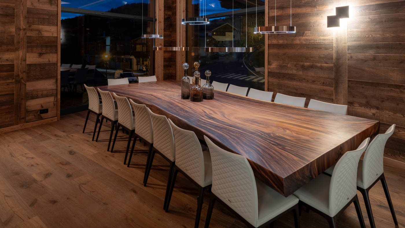
Photo by interior architect Shep&Kyles.
Opting for contrasts usually leads to more visually striking effects. This involves pairing different types of timbers and materials to create an engaging interplay of textures and hues. A thoughtful approach usually involves a range of wood tones to ensure a layered and interesting look. The key is to create a space where different wood tones coexist, each contributing to the overall beauty and uniqueness of the room.
Attempting to match wood colours with existing timbers in the room, such as the flooring, overlooks the inherent complexity of wood. Each piece of timber, from the same species or even the same tree, carries a unique set of hues, making an exact match nearly impossible. This pursuit not only proves fruitless but can also result in a lacklustre and disjointed aesthetic.
The reality of wood’s natural variation means that what seems like a match in theory often clashes in practice. For instance, an oak dining table may differ subtly in shade from an oak floor, disrupting the room’s visual flow. However, there is a nuanced way to navigate this challenge.
When incorporating standout furniture pieces, the usual rules can be modified. A statement piece, such as a French Oak table with wide pieces, will stand out against a backdrop of varied wood hues. The focus here is on the individual character of the piece. However, if your option is a more typical oak table made from many different pieces, you’re better off selecting an entirely different material. We’ll delve more into bending these rules later.
The key is to appreciate and utilise the diversity of wood, using it to enrich the space rather than seeking uniformity. Embracing these variations allows for a more dynamic and visually interesting interior, where the natural beauty of each wood element is given the space to shine.
There are some scenarios where matching wood tones can work. These exceptions are often defined by the use of standout pieces, where the uniqueness and quality of the furniture ensure the piece stands out in its own right.
A good example is a high-quality oak table with wide planks (a maximum of three wide planks for the entire top). The key here lies in the distinctive nature of the table – its boldness and singular beauty enable it to stand out, even against a backdrop of similar wood tones.
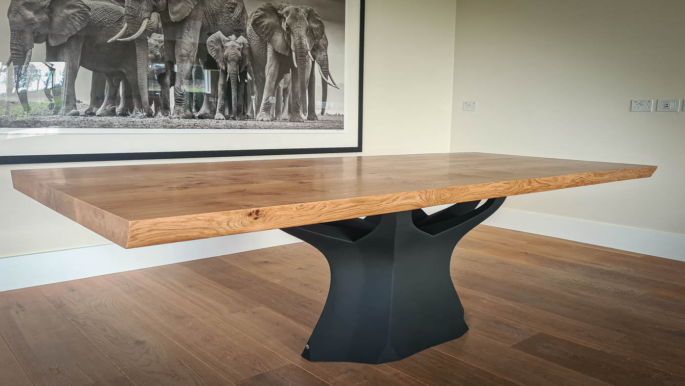
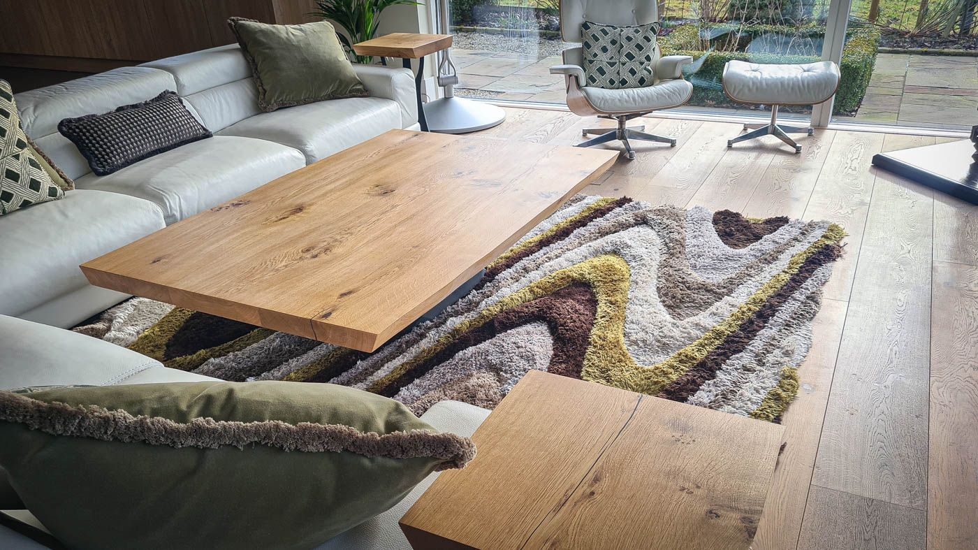
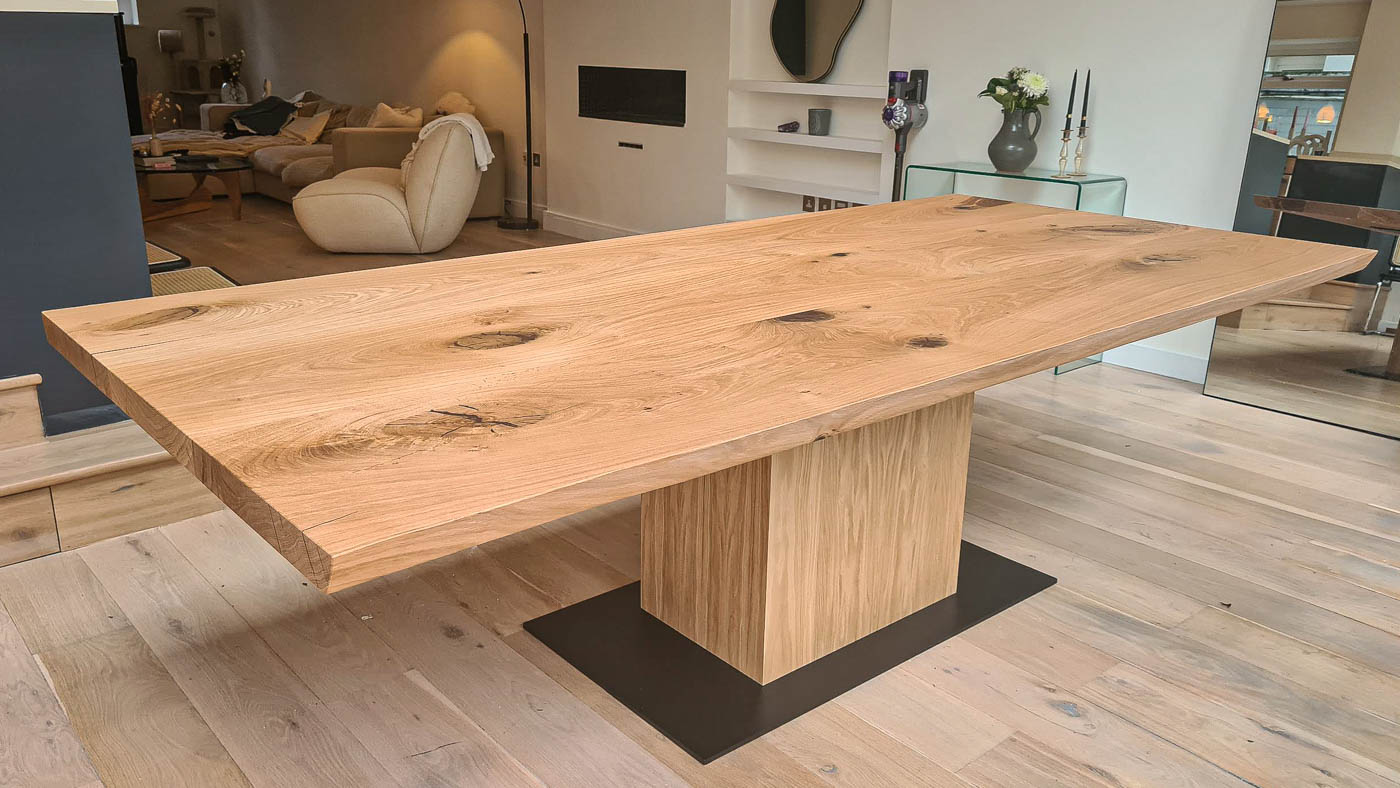
Another method, when table and floor tones are similar, is introducing bold separators. For example, this could mean selecting a table with a base of a different material, such as steel, or pairing the table with chairs in a contrasting style or colour. A large rug under the table also serves as a visual buffer, creating a clear distinction between the floor and the furniture.
In these instances, the usual rules of avoiding matching woods are set aside in favour of a more nuanced approach. It’s a balance of understanding the wood’s intrinsic qualities, the furniture’s design, and the context within which they sit. When done right, the result is a space that feels both unified and invigorated.
Integrating colour and texture is pivotal in elevating interiors that feature various wood tones. This approach can bring together a cohesive yet dynamic aesthetic, enhancing the room’s overall design.
Selecting an appropriate colour palette for walls and fabrics is crucial. For interiors dominated by warm wood tones, soft, muted colours or cooler shades can create a balanced look, and vice versa for spaces with cooler wood tones. The aim is to provide a visual contrast that accentuates the wood without dominating it. However, it’s important to remember that these aren’t hard and fast rules, and you can play with various colour palettes to create a balanced and interesting space that appeals to your personal taste.
Different textures also add depth and richness to a space. Soft furnishings such as cushions, throws, or rugs with varied tactile qualities can subtly connect furniture pieces of different wood tones. Bold patterns or weaves in textiles can also serve as focal points, drawing the eye and lending a sense of unity to the room.
Upholstered furniture offers additional layers of texture and colour. Opting for fabrics that contrast with your wood tones can make each piece distinct. For example, a plush velvet sofa in a deep, rich colour can beautifully offset a light wood coffee table, adding a luxurious feel to the room.
The furniture placement and the overall layout of a room are critical in achieving a balanced look, especially when working with mixed wood tones.
Start by identifying the focal point in the room. This could be a statement piece of furniture, a fireplace, or a striking piece of art. Arrange other furniture around this focal point in a way that draws the eye naturally through the space. For instance, a dark bookcase could be used as an anchor, with lighter wood pieces positioned around it to create a balanced contrast.
It’s also important to distribute the visual weight of the room evenly. If you have a heavy, dark wood piece on one side, balance it with a similarly substantial piece on the other side of the room. This could be achieved through symmetry or by balancing a large item with several smaller pieces that add up to a similar visual weight.
Area rugs can also be invaluable in defining different zones within a room, especially in open-plan spaces. A rug can anchor furniture, providing a visual base that ties together different wood tones. The texture and colour of the rug can also add another layer to the room’s overall palette.
Ensure that the arrangement of furniture allows for easy movement and flow through the room. The pathways should feel natural and unobstructed, which helps create a sense of order and spaciousness, even in a room with various tones.
By carefully considering the placement of each piece of furniture and the room’s overall layout, you can create a space that is not only aesthetically pleasing but also functional and inviting. This thoughtful approach to design ensures that the various tones work together to create a cohesive and welcoming environment.
Accessorising is vital in tying together a room with mixed wood tones. The right choice of decorative items will create a finished, polished look. Here are some key accessories that you can introduce:
Artwork: Art can serve as a unifying element, especially when it incorporates colours and textures that resonate with the various wood tones in the room. A piece of art with earthy, natural hues can draw together disparate wood elements, creating a cohesive visual story.
Plants as Natural Connectors: Greenery and plants can be highly effective in rooms with mixed wood tones. Not only do they add a fresh, organic feel, but their natural green hues can act as a neutral connector between different woods, softening any stark contrasts.
Textiles and Cushions: Soft furnishings like cushions, throws, and curtains can subtly bridge the gap between wood tones. Choose textiles that either pick up on the undertones in the wood or introduce complementary colours to the room’s palette.
Lighting Fixtures: The style and material of lighting fixtures can influence the room’s overall feel. A carefully selected lamp or chandelier that aligns with the room’s aesthetic can enhance the wood tones and add cohesion to the space.
Through thoughtful accessorising, each element in the room contributes to a sense of unity without diminishing the individual beauty of varied wood tones. This approach enhances the aesthetic appeal of the space and creates an inviting and comfortable environment.
Navigating the complexities of mixing and matching wood tones can transform a space. This guide has provided key insights into making informed choices that balance contrast, texture, and colour, elevating the overall aesthetic.
Emphasising the importance of thoughtful design, from selecting standout pieces to strategic placement and accessorising, the goal is to create a cohesive yet dynamic environment. Each decision, whether it’s a contrasting rug or a complementary accessory, contributes to the harmony of the space.
Interior design is an art of balance and personal expression. Embrace the diversity of wood tones as an opportunity to infuse your space with richness and character. Trust your style, experiment with different elements, and craft a space that reflects your unique taste and becomes a cherished part of your home.